Infection Rates DONT MATTER
Fear mongering by the media and gov officials is rampant. Stop paying attention to infections and start paying attention to hospitalization and death rates. Here are facts.
Nationwide “excess deaths” (total deaths) are down. Note they are below the norm (brown line).

Hospitalizations are down. This graph lists covid19 visits based on age. There are local hospitals overloaded or nearly so, but that doesn’t match the overall trend nationwide. Note there is a slight uptick but nothing above the dashed line. Also note we never went over 16% (remember we were told we would hit 100% and overwhelm the entire healthcare system.) The only place that got overwhelmed was New York that I know of – and they weren’t really overwhelmed – they barely used their hospital ship and didn’t really open any of the temporary military hospitals/hotels.

Another interesting infographic shows real time hospital utilization. In this case I selected New York (the largest caseload). They are 22.48% no where near 100% utilization. Proof that there are no true “hot spots” nationally (again there may be locally).

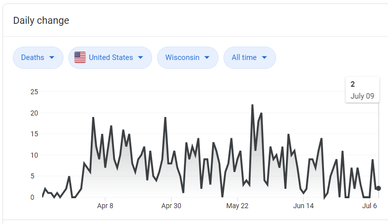
Looking exclusively at Covid19 Death vs Infection rates the graphs are opposite. Note the increasing trend started June 14, so we are more than 14 days in without a corresponding increase in hospitalization or deaths.
The graph below is the “scary upward trend” – but note it doesn’t correlate to hospitalizations OR deaths. We have MORE than flattened the curve, now we are flattening livelihoods and freedom instead.

By all measures that matter, the situation is improving. Before you say the hospitalizations will spike, the 14 day infection / hospitalization cycle is not reflecting spikes (we are over 3 weeks since June 14 when the upward trend started).
There are LOCAL situations where the hospitals are full or nearly full – that is why we have a hospital SYSTEM in the US that allows patients to be transferred.
We are collectively in single digit to low double digit hospitalization rates in 95%+ areas of the USA. There is no need for the fear mongering, the high infection – low death rate ratio should be GOOD NEWS.SOURCE DATA:CDC hospitalization rate decreases (curve) graph with red
*FOCUS ON THE FACTS* not the hyperbole